PUBLIC POLICY:
Internet Freedom Foundation
THE ORGANISATION
The Internet Freedom Foundation (IFF) is a Delhi-based digital rights organisation that defends privacy, free expression, and innovation online. They've been at the forefront of a lot of seminal cases in the country and shaped major policy. And each year, they have their flagship event called Privacy Supreme.
THE GOAL
To transform privacy from a legal doctrine into a lived, felt experience by creating a visual and participatory language that connects law, technology, and imagination. The campaign aimed to provoke reflection, not instruction: inviting people to question what privacy meant in the past, how it’s eroding now, and what it might become in the future.
THE PROBLEM
Traditional policy communication struggles to make legal ideas tangible or emotionally legible to the public. The Puttuswamy ruling, what privacy supreme marked, enshrined the right to privacy in the Constitution. The erosion of it today and its implications need to be felt, not just read academically.
MY ROLE
Everything, almost. I created the entire brand language from the social media posts, event backdrops, merchandise, and activations. Copy and design.
THE SOLUTION
THE CCI
Privacy Supreme 2025 treats the right to privacy not as a clause to be cited, but as a living, unstable idea. One that shifts across time, technology, and imagination.
Drawing from Days of Future Past, the campaign asks: what if we could revisit pivotal moments in our legal past to alter the futures being built around us?
Through speculative design, play, and print, the idea was to transform jurisprudence into an immersive experience that changed depending on the medium, may it be zines that remix case law into fiction or a postcard that you fold to create new lines to the future and the past.
The goal: to make constitutional values felt, not just read; to transform privacy from a doctrine into a shared, felt, evolving imagination.
THE IDENTITY:
EVERPRESENT
INTERACTABLE
A MERGER OF
HOPE AND FEAR
VISUAL IDENTITY
The visual identity of Privacy Supreme 2025 was designed to sit between constitutional gravity and speculative play, a collision of courtroom and cyberpunk aesthetics.
The design resists the bureaucratic flatness typical of typical Indian policy communication; instead, it builds a visual world that feels archival yet futuristic. Something that would be unearthed from a speculative government file.
This identity threads through every medium: from zine covers and postcards to large-format standees, maintaining coherence while allowing each artefact to carry its own temporal mood.
Colour Palette
The palette borrowed from surveillance aesthetics (deep blacks, machine reds, and glitchy gradients) and classical science fiction but rendered them with the softness of pulp print, suggesting both digital overreach and human fragility.
Further defined with gradients that evoke both digital interference and a changing timeline, the colour palette is meant to be read not just linearly, but through movement.

Deep Saffron
E04A3B

Eternal White
FFFFFE

Staunch black
000000

Machine Green
0F472E

Temporal Blues
387A8C
Typography
The campaign’s typography builds on the tension: The primary type Major Mono Display, a monospaced, mechanical typeface, evokes machine logic, data terminals, and state bureaucracy. In contrast, Mukta, used for the Devanagari script, grounds the design in contemporary Indian public typography: clean, legible, civic.
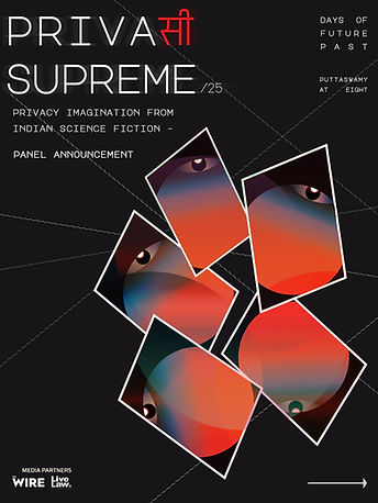
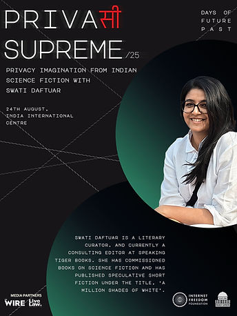
The logotype fused two scripts, Latin and Devanagari, to mirror the hybrid, contested nature of the legal system in India. By splicing PRIVAसी SUPREME across alphabets, it visualises a linguistic and cultural entanglement: the language of colonial history and the language of constitutional identity occupying the same line, uneasily but inseparably. The added blur is supposed to signify the shaking past, present and future.
Plus, it's got a nice bilingual joke going for itself.

major mono display
the quick brown fox jumps over the lazy dog.
Mukta
चूंकि मानव अधिकारों के प्रति उपेक्षा और घृणा के फलस्वरूप ही ऐसे बर्बर कार्य हुए जिनसे मनुष्य
Visual Elements
The surrounding visual system was comprised of orbital gradients, dashed lines, and fragmented eyes. Each element gestures toward surveillance architectures and temporal loops, echoing the campaign’s core theme:
looking backwards to alter the future.
I'll let the work itself do the talking from here.
Make your way through.
Wayfinding


The Backdrop

The Giveaways
To play and remember


IFF Zine Cover Page 1

IFF Zine Cover Page 2

IFF Zine Cover Page 8
IFF Zine Cover Page 1
And some extra assets
Social Media and presentations need some love too.